The Data Grid control is a grid control that can present information about elements in a single package (it is NOT recursive) or an existing EA search in a table.
Subject to any read only restrictions set by the designer, the user also can make changes to the displayed fields as well as add new elements by entering data in a new row at run time.
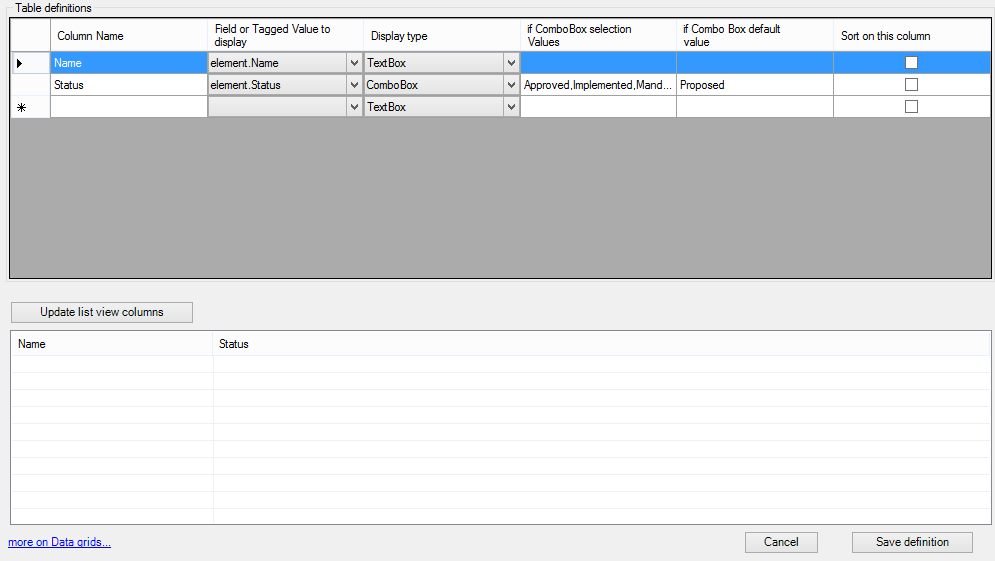
A simple example is shown below where a simple list is provided and the user can modify the status.
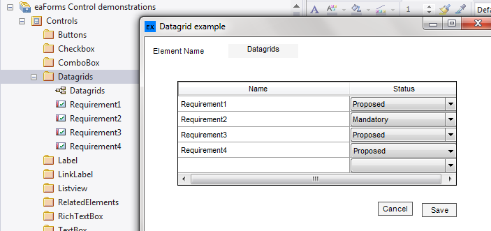
Although this is a trivial example and something that can readily be done within EA using the View as List option, the power comes from the ability to do this:
1. Without a diagram
2. Specify the fields that are relevant to your users
3. Perform all these with any MDG or a set of MDG's within the same form
4. Include check box
Adding a Datagrid
When you select "Add Data Grid" you will be presented with a dialog to enter information that defines the content to be displayed as illustrated below.
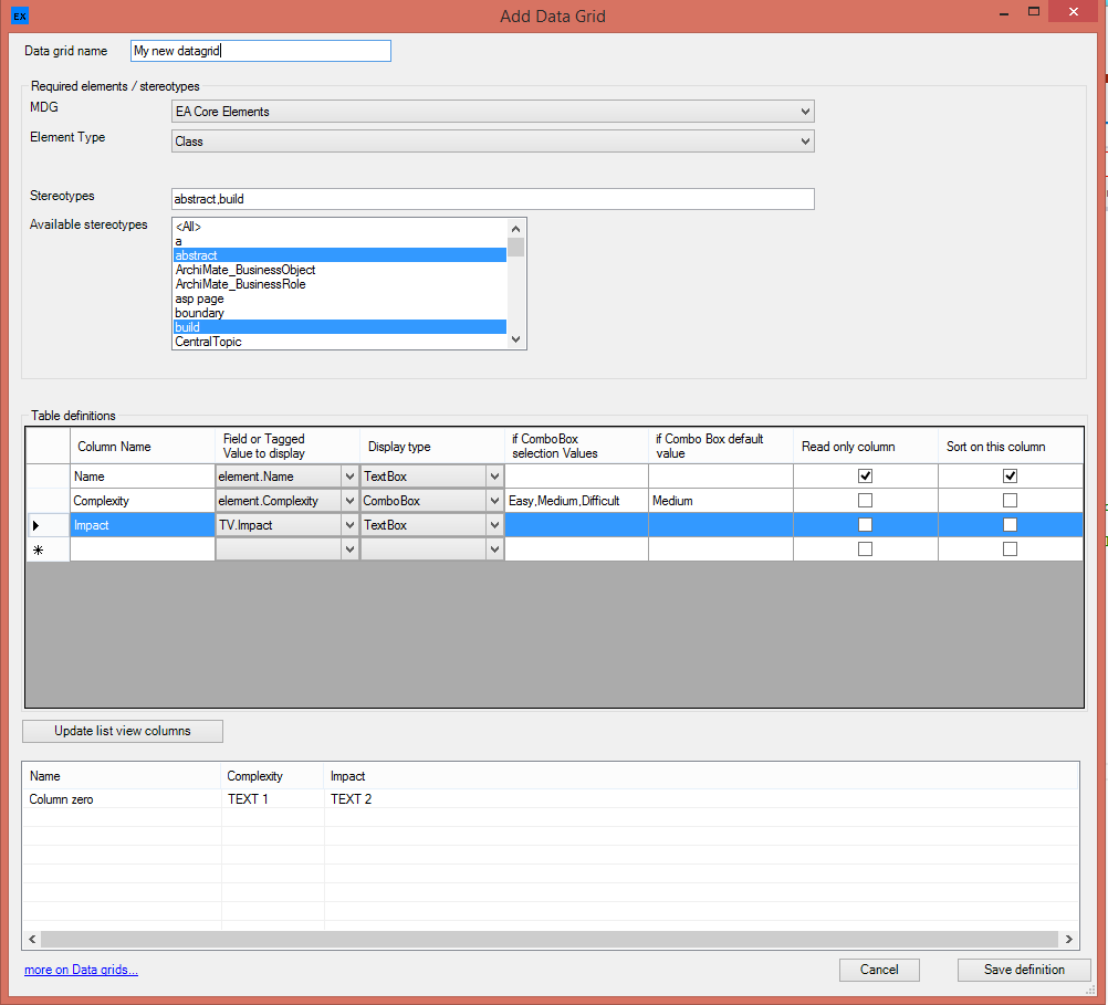
To define a Data Grid Control for elements:
| 1. | Define a name for the data grid |
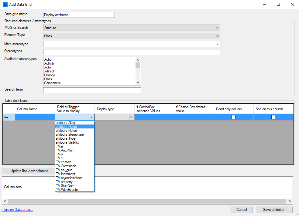
| 2. | Select the MDG relating to the elements that you wish to display - selecting the Stereotypes or MDG type (which will be displayed automatically upon selecting an MDG). If you wish to use the results of an EA Search in the model then select EA Search (see below). If you are designing a class form you also have the option to display attributes in the datagrid - select Attribute from the MDG dropdown (see below) |
Note: we have provide the option to display a set of stereotyped elements - which can be selected from the list of available stereotypes; the list used is the CSV list shown in the Stereotypes box
| 3. | In the table definitions, each row represents the information that will be display in a column, using the order they are defined in the table. You must: |
| • | Enter a name for the column |
| • | Select the field or tagged value from the drop down list |
| • | Select the way you wish the item to be displayed (Textbox, ComboBox or CheckBox), and if setting the ComboBox a pop-up dialog will prompt (see below) to capture information to be used in presenting the ComboBox. A Textbox is set by default if no values are specified/ |
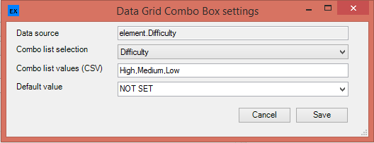
In addition, you can:
| • | Set a Text box column as a sort column (only 1 column can be selected for a datagrid) - this will set the sort order on load. The user can click on column headers to change the sort order when working within the eaForm |
| • | Set a column as read only - this will prevent the user modifying the contents of the item |
Modifying Data Definition
You can edit the datagrid definition and using the right click context menu on a selected data row move the row (which will become a column) up or down in the order, as well as delete any unwanted rows.
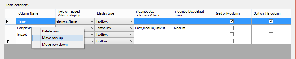
Look and feel of run time Datagrid
To help get an idea of what the datagrid will look like we have included a table at the bottom of the page.
To use this when you have completed the datagrid table definition:
| 1. | Press "Update list view columns" |
| 2. | Drag the column dividers as required to set the relative size of the columns (note the Datagrid will be scaled to the size of the eaForm) |
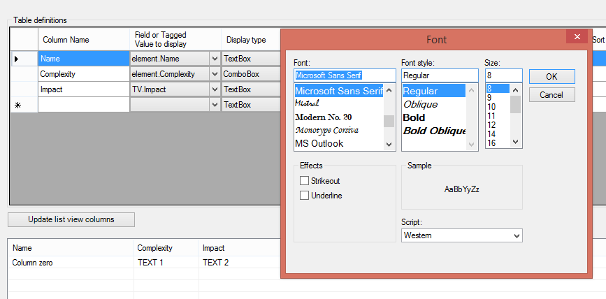
| 3. | Double click on the example data row (starting column zero) which will present a pop-up dialog that you can use to define the font to be applied to the datagrid (as shown below) |
Display results from an EA Search
To display the results of an EA Search select "EA Search" from the MDG dropdown.
When selected the the display will change to allow the selection of the required search from a list of searches found in the current model.
The remaining definition of the Datagrid is identical to that described above.
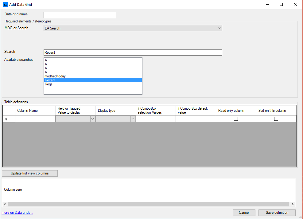
Note: At present the search must exist in the model in both the designers model and the model in which the form is used.
Display class attributes in the datagrid
Check out the DataGrid reference for more information on using this control.
Using the Datagrid
The Datagrid control presents a table that can be configured to contain a wide range of information associated with either elements or packages contained within packages or elements contained within elements.
The table contents may be filtered by type and stereotype to display that information which meets the designers needs.
At run time the user can editor those fields that have been enabled (i.e. not flagged as read only); they can also create new elements that will be placed under the current package or element - see below.
Also the user can access the elements listed by double clicking on the selected item, at which point the appropriate eaForm will be launched.
| • | Datagrid definition - the designer can add row by moving down in the table ( a potential new row is added every time a row is populated, but not included in the definition until content is provided). |
| • | Datagrid definition - the designer can delete, move rows using the right click context menu |
| • | Datagird sizing - the Edit Datagrid properties dialog is changing, but not fully implemented yet. |
What you see is a box below the table definitions which will provide a WYSIWYG view of the sizing, column widths and fonts for the run time datagrid.
This is not working yet!!
Creating new elements at run time
The user of an eaForm can create new elements at run time by creating a new row at the bottom of the datagrid provided the datagrid includes "element.name" as a column. With this column defined, if any data is entered in the row then a new item will be created, even if the name has not been defined - a name "UN-NAMED"
Also note that if multiple stereotypes have been defined for presentation it will be the MDG type (Stereotype) for MDG's and the selected Main Stereotype for EA Core Elements that is used when creating any new element.
BUT beware - we have provided flexibility in this control and hence care should be take to ensure that the definition is complete.
Combo list values
When selecting a combo list display a comma separated list should be entered. When there is a need to values that contain "," the designer can specify the tokens with square [] brackets e..g. [<100],[200],[10,000],[>10,000] - the brackets are not displayed. If brackets are used they MUST be used for all items in the list
Default values for ComboBox
When a datagrid is presented which contains ComboBox selection columns the value shown will be that of the underlying element field. When creating a new element row and if the designer has set a default value this will be presented.
Control specific attributes
| • | Datagrid properties - a datagrid properties window is presented to allow the designer to provide all the detail needed in defining the datagrid |
| • | Enabled - means that the control will be presented at run-time - the default is that the control will be presented. |
| • | Autosize - relates to controls that will adjust their size to the contents - e.g. labels, buttons |
| • | Tab order - is the sequence number that is used by windows to move through the controls at run time |
| • | Anchor - this sets the reference point of the form against which the control is fixed and affects the movement of the control if the run time form is resized. Valid values consist of a combination of these letters to indicate where the control is locked |
- T (top)
- B (bottom)
- L (left)
- R (right)