Each eaForm control has a set of attributes that can be set - and these are presented on the Attribute group.
The screenshot below illustrates all attributes - note all are available for each control and so may not be present.
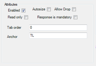
If present the control attributes have the following effect:
| • | Enabled - means that the control will be presented at run-time - the default is that the control will be presented. |
| • | Autosize - relates to controls that will adjust their size to the contents - e.g. labels, buttons |
| • | Allow drop - where applicable allows the user to drag content onto a control |
| • | Read only - means that the user will not be able to edit the contents, useful for setting a combo box where the user must select a provided value. In the case of a datagrid when set it will override any individual read only settings within the datagrid |
| • | Response is mandatory - used to mandate that the selected value must be set - the current rule is to check for a valid value that is not a null string |
| • | Tab order - is the sequence number that is used by windows to move through the controls at run time |
| • | Anchor - this sets the reference point of the form against which the control is fixed and affects the movement of the control if the run time form is resized. Valid values consist of a combination of these letters to indicate where the control is locked |
- T (top)
- B (bottom)
- L (left)
- R (right)
| • | Save and close on double click - for some controls i.e. Datagrid and listview, which present the option to launch a subform from a double click of a line entry this option, when set, will close the current form (saving its contents) before opening the new form |
| • |