|
eaForms provides a set of List Views that can be included on a form to display information. In some cases the user can select an item and open to inspect and modify the item.
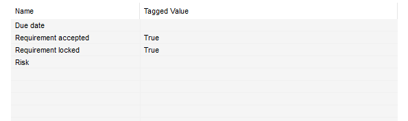 Example of a simple listview control
Available listviews
Listview can be used to display:
| • | Element collections - where the list will display the name and description for each item in the collection |
| • | Gadget List Views - these are specific eaForms listview that include the enhanced functionality that will open a subform for the selected item when double clicked. The following collections can be listed: |
| • | Class attributes - lvAttributes |
| • | Class operations - lvOperations |
| • | Use Case linked actors - lvActors |
| • | Use case Pre Conditions - lvPreConditions |
| • | Use case Post Conditions - lvPostConditions |
| • | Element linked elements - lvLinks |
| • | Element elements collection - lvElements |
| • | Element tagged values - lvTaggedValues |
| • | Element files - element.Files |
When adding a List View the form designer is presented with a dialog that allows them to select the desired data source.
In the example illustrated below for a Class element there are gadget Listview's for either Attributes or Operations.
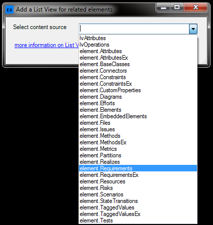 Select the required element collection or element type specific options
Listview specific functionality
For listview sources which start with the name "lv" then they are "gadgets" which support operations which allow the user to view and edit the underlying detail or in the case of lvlinks open the linked item. In addition, in most cases an "add" button is available and can be added to an eaForms to allow the user to add a new item.
In addition for the following standard fields we have provided other functionality:
| • | element.Files - with the ability to double click on an item and open the relevant local file or web address (in the users default browser). |
Listview Control specific attributes
This section provides more information about button specific settings.
| • | Content Source - the collection to be used as the data source - could be an element collection or an eaForms gadget list |
| • | Autosize - relates to controls that will adjust their size to the contents - e.g. labels, buttons |
| • | Read only - means that the user will not be able to edit the contents, useful for setting a combo box where the user must select a provided value |
| • | Response is mandatory - used to mandate that the selected value must be set - the current rule is to check for a valid value that is not a null string |
Standard control attributes - available to all control
| • | Enabled - means that the control will be presented at run-time - the default is that the control will be presented. |
| • | Tab order - is the sequence number that is used by windows to move through the controls at run time |
| • | Anchor - this sets the reference edges(s) of the form against which the control is fixed and affects the movement of the control if the run time form is resized. |
Valid values consist of a combination of the letters below:
|